
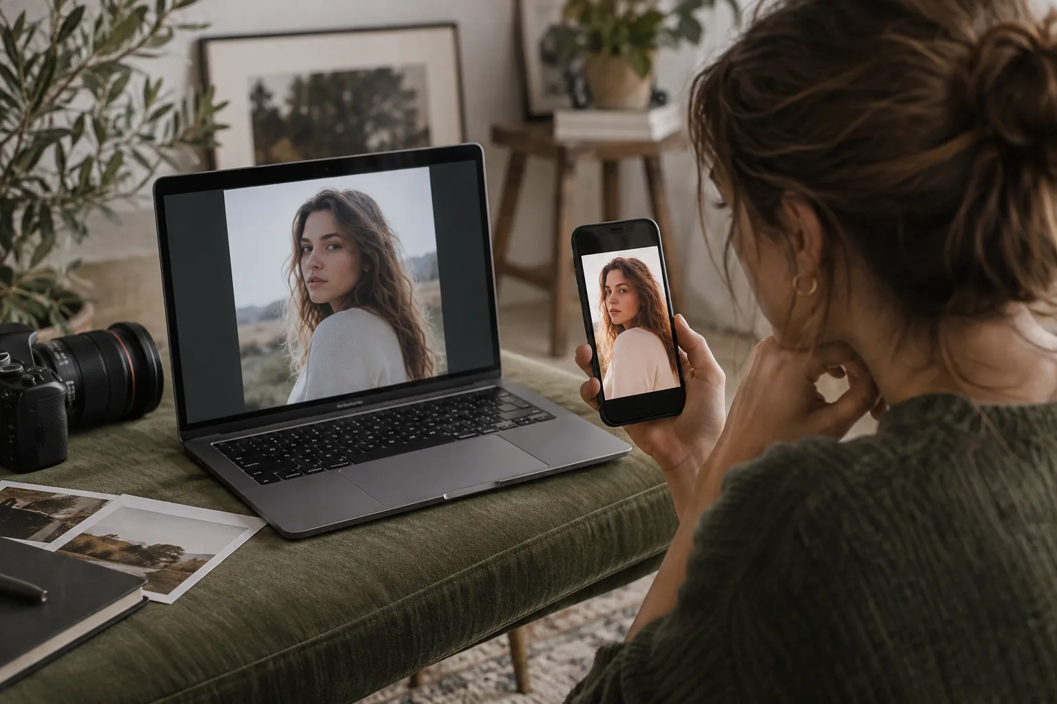
Why Do My Photos Look Different on My Phone? A Photographer’s Guide to Color Differences
You finish editing a session in Photoshop, everything looks exactly the way you want it, and then you open the finished images on your phone.
Suddenly the skin tones look warmer. The greens are more saturated. The shadows seem darker. Or the whole image just feels different.
Before you start re-editing the gallery, there’s an important thing to know: the file may not be the problem. The screen displaying it may be.
Different screens, color profiles, display settings, apps, and viewing environments can all change how an image appears. You can’t make a photograph look identical on every screen your clients own, but you can create a reliable editing and export workflow that greatly reduces unpleasant surprises.
Start With Your Editing Monitor
Your editing screen is the reference point for every color decision you make. If that reference isn’t reliable, you may unknowingly compensate for what your monitor is showing you.
For example, if your monitor is unusually cool, you may warm up skin tones to make them look correct. Open the finished image on a more neutral display and those same skin tones may suddenly look too warm.
The same problem can happen with brightness. Editing on a very bright display can lead you to produce images that look darker on other devices or in print.
For photographers doing color-critical work, calibrating and profiling the editing monitor with a hardware calibration device is the most reliable approach. Calibration isn’t about making your monitor look prettier. It’s about making it a trustworthy reference for your editing decisions.
Check the Color Profile of Your Image
One of the first things to check when an image looks dramatically different outside Photoshop is its color profile.
Photoshop uses color management to interpret the color values in an image. If you’re editing in a wide-gamut space such as Adobe RGB or ProPhoto RGB and then export a file incorrectly, another application may interpret or display those colors differently.
For images being delivered for normal online viewing, sRGB is generally the safest choice because it is designed for broad compatibility across displays, browsers, and applications.
In Photoshop, you can check the document’s profile and, when appropriate, use Edit → Convert to Profile. Then choose sRGB IEC61966-2.1 as the destination profile for your web or digital-delivery copy.
There’s an important distinction here: Convert to Profile and Assign Profile are not the same thing. Converting changes the image’s color values as necessary to preserve its appearance in the destination color space. Assigning a different profile changes how Photoshop interprets the existing values and can dramatically change the way the image looks.
If your goal is preparing an existing image for sRGB delivery, you generally want to convert, not simply assign sRGB.
Make Sure the Profile Is Embedded When You Export
Converting to sRGB is only part of the workflow. You also want the exported file to carry information telling color-managed software how its colors should be interpreted.
When saving an image from Photoshop in a format that supports profiles, make sure the color profile is embedded.
A missing profile doesn’t guarantee that an image will look wrong. Many applications will assume sRGB. But relying on every app and device to make the same assumption introduces another variable you don’t need.
A simple digital-delivery workflow is:
- Finish your master edit in your preferred working color space.
- Create your delivery or export version.
- Convert that version to sRGB.
- Export it with the sRGB profile embedded.
- Check the exported file rather than judging only the working file inside Photoshop.
Check Your Phone’s Display Settings
Sometimes the exported image is perfectly fine and the phone itself is changing what you see.
Modern phones have sophisticated displays, and many include features designed to make the screen more comfortable or visually appealing rather than serve as a color-critical photography monitor.
Depending on your phone, automatic display brightness, Night Shift or similar blue-light reduction modes, True Tone or adaptive color-temperature features, accessibility color filters, and manufacturer-specific vivid or enhanced color modes can all affect what you see.
If you’re comparing an image on your phone against your calibrated editing monitor, temporarily disabling display adjustments can make the comparison more meaningful. Also try to match the brightness of the two displays reasonably well. A phone at maximum brightness beside a dim editing monitor isn’t a particularly useful comparison.
Make Sure You’re Comparing the Same File
This sounds obvious, but it’s worth checking.
Don’t compare the Photoshop master on your computer with a version you texted to yourself, uploaded to social media, downloaded again, or sent through another service. Apps and online platforms may resize, recompress, convert, or otherwise process uploaded images.
For troubleshooting, transfer the actual exported JPEG directly to your phone and view that file first.
If the direct file looks good but a social-media upload doesn’t, you’ve learned something important: your Photoshop export probably isn’t the source of the problem. You can then investigate what happened during upload or display in that particular app.
Compare More Than One App
If a photo looks strange on your phone, open the same file in another application.
Compare the image in your phone’s native photo viewer with the version displayed in a browser or another color-aware application. If one app looks dramatically different while the others are similar, that points toward an app-specific color-management or processing issue rather than an editing problem.
This is much more useful than immediately going back into Photoshop and changing your edit.
Don’t Ignore the Room You’re Standing In
Your eyes adapt constantly to the light around you. An image viewed in a dim editing room can feel very different when you look at it on a bright phone outdoors. Warm household lighting, daylight, display brightness, and the colors surrounding the screen can all affect your perception of an image.
That’s one reason professional color workflows try to create consistent viewing conditions. You don’t need to turn your office into a color laboratory, but consistency helps. If you’re making important decisions about skin tones and color, avoid evaluating them with wildly different screen brightness levels and lighting conditions.
A Quick Troubleshooting Checklist
- Check your editing monitor. Is it calibrated and profiled, and is the brightness reasonable?
- Check the image profile. Know which color space you’re actually working in.
- Create an sRGB delivery copy. Use Convert to Profile rather than casually assigning a new profile.
- Embed the profile. Don’t strip useful color information from the finished file.
- Transfer the actual export to your phone. Avoid social media or messaging apps while troubleshooting.
- Turn off adaptive phone display settings temporarily.
- Compare the image in more than one app.
- Compare under similar lighting and screen brightness.
If the image still looks dramatically different after those checks, then it’s worth digging deeper into your monitor profile, Photoshop color settings, export process, and the particular device or app where you’re seeing the shift.
Your Clients’ Screens Will Never All Match
This is perhaps the most important expectation to set.
You can control your editing environment. You can control your color-management workflow. You can control how you export your files. You cannot control every screen your clients use.
One client may have an older laptop with a cool display. Another may have a bright OLED phone with adaptive display settings enabled. Someone else may view the gallery on an uncalibrated office monitor.
The goal isn’t to somehow create a JPEG that looks absolutely identical everywhere. That’s not realistic. The goal is to build a consistent, color-managed workflow on your end so you’re delivering files from a reference you can trust.
Then, when something looks wrong on one particular device, you have a process for figuring out whether the problem is the edit, the export, the application, or simply the screen displaying it.
That beats re-editing an entire gallery because one phone made the skin tones look strange.